Charts
Charts can be created in sections on the dashboard →
Creating Charts
To create a new chart, click on the Edit button in the section header > click on the "+" > click on Add Chart
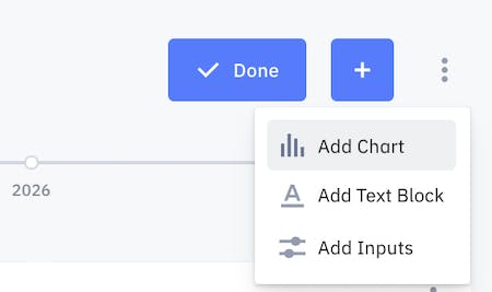
Chart Settings
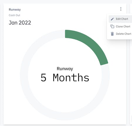
You can configure your chart settings and customize your charts. To access Chart Settings, click on the 3 vertical dots on the top right corner of the chart > Edit Chart.
Scenarios
By default, the 'one scenario' will be selected when your chart is first created. If you'd like to build a chart that compares data from multiple scenarios, select Multiple Scenarios. The All Scenarios option is only available for Line Charts and Scorecards.
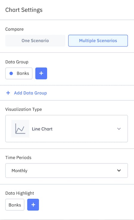
Data Group
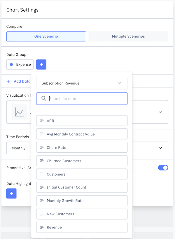
You must select a data group to create a chart. Click on the "+" sign and it'll populate a list of reports and models you can reference. Select the data group. You can add more than one data group to the chart.
To edit the data group, click on the data group label. You can invert data to reverse the sign, delete data, or change the color of the data group by clicking on the colored circle.
Visualization Type
There are 9 types of charts you can use and switch between depending on how you want to display your data.
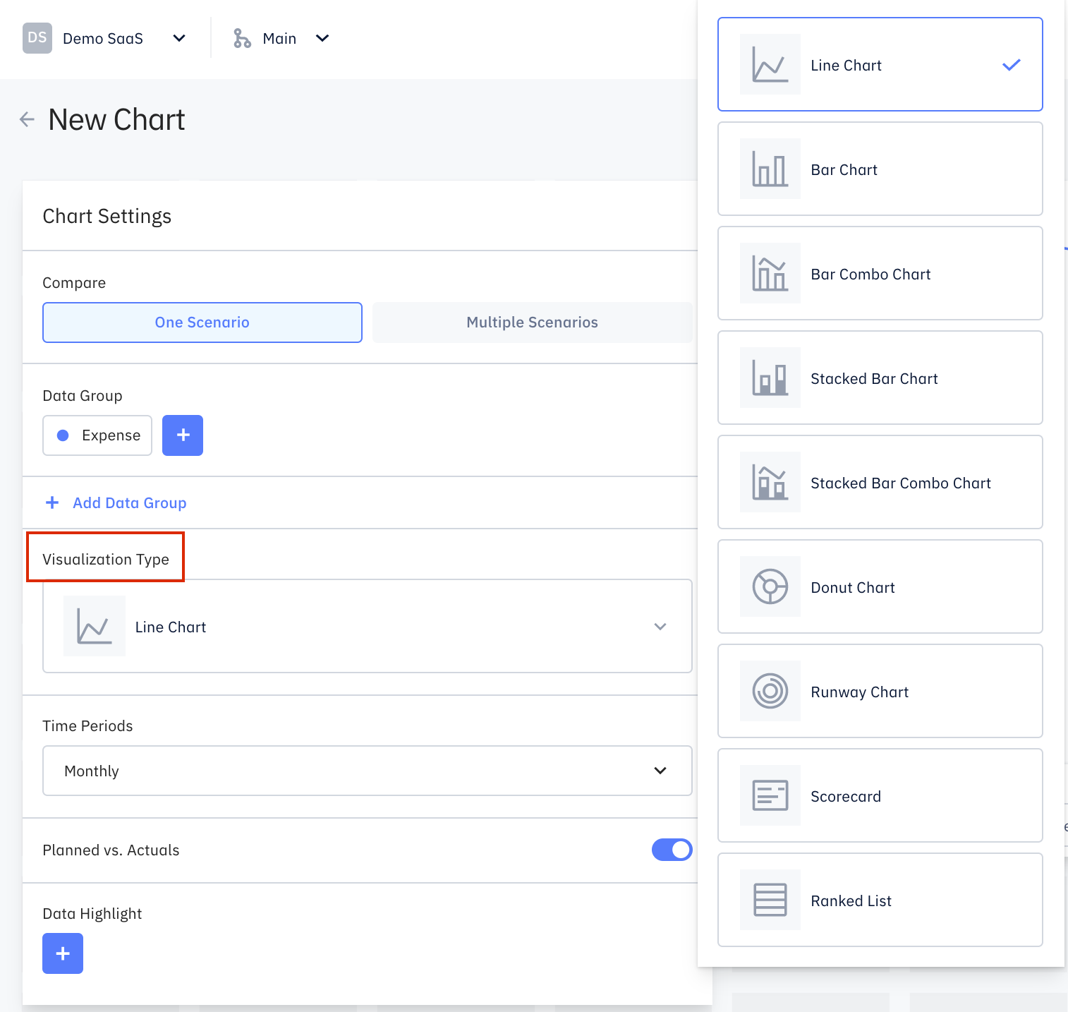
- Line Chart - tracks changes over time or compares changes over the same period of time between different data groups.
- Bar Chart - tracks changes over time or compares changes over the same period of time between different data groups.
- Bar Combo Chart - displays data using a number of bars and/or lines, each representing a data group.
- Stacked Bar Chart - compares numeric values between levels of a data group.
- Stacked Bar Combo Chart - displays data using a number of bars and/or lines, each representing a data group and with the bars stacked comparing numeric values of the data group.
- Donut Chart - displays the proportions of a data group, with the size of each piece representing the data category. You can include a Total Label to show on the chart.
- Runway Chart - displays the number of months based on your Banks data group. You can set the runway chart max value up to 36 months.
- Scorecard - displays the data group(s) in numeric value.
- Ranked List - displays the ranking of the categories under the data group. You can select the number of rows to display.
Forecasts vs Actuals
Forecasts vs Actuals is available to two main type of charts: line and bar charts. Turning on Forecasts vs Actuals will include the past forecasts on the chart.
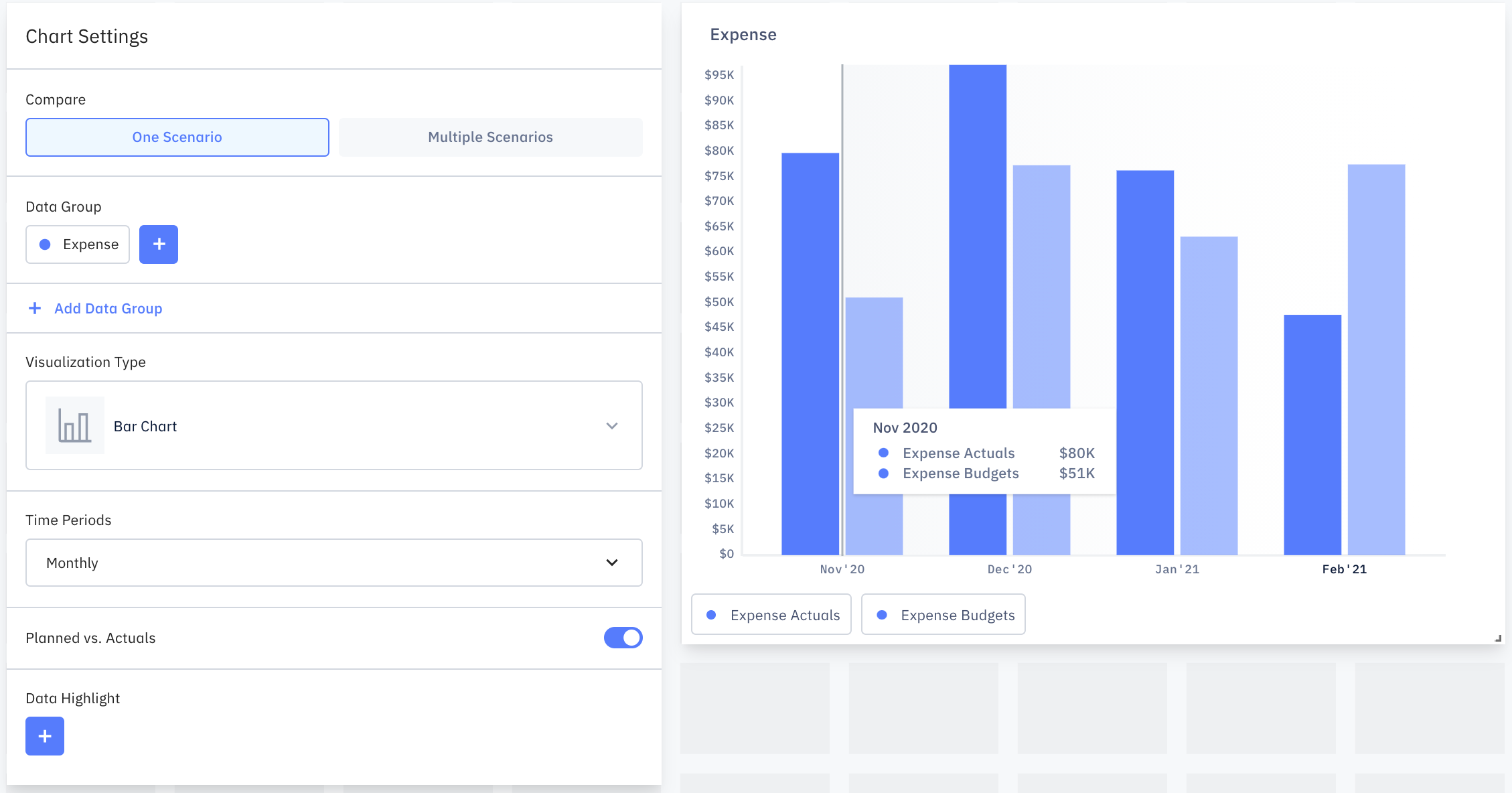
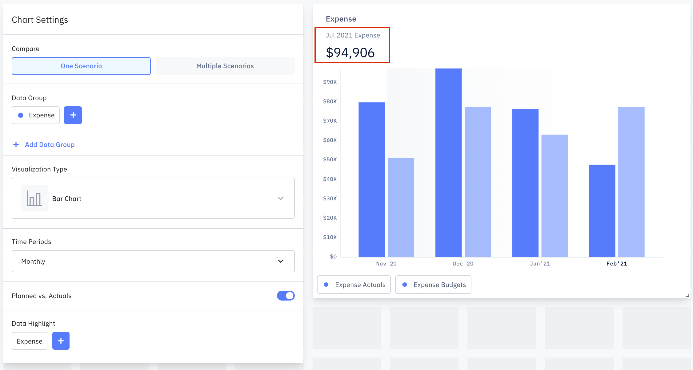
Data Highlight
Toggling the Data Highlight will show the numeric value of the highlighted data group on the chart.
Resizing & Reorder charts
On the dashboard, you can resize and reorder your charts directly. Click on the Edit button on the right. You can resize by dragging the bottom right corner of any chart(you will need more grid space if you want to increase its size).
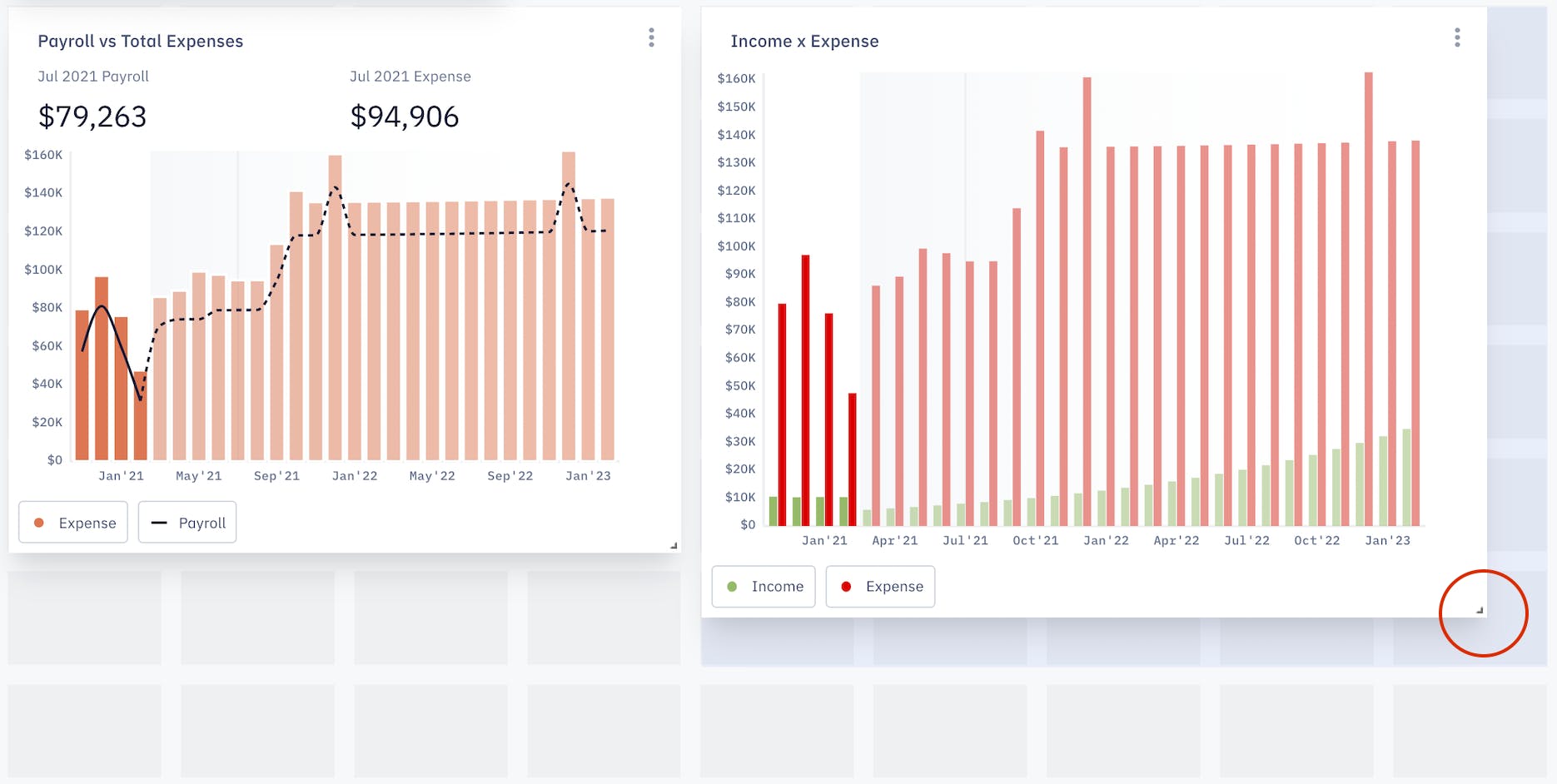
You can move the chart to a new grid space to reorder the charts.
Click Done to save changes.